


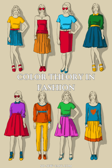
Color plays an essential role in fashion, as it helps create aesthetically pleasing outfits and influences our emotions. By understanding color theory in fashion, you can better combine clothing items, choose colors that flatter your figure, and express yourself through your wardrobe. This article will delve into the three main color schemes, the emotions associated with different colors, and practical tips for choosing the right colors in various situations.
What Are the Three Main Color Schemes in Fashion?
When it comes to color theory in fashion, there are three primary color schemes to consider: complementary, analogous, and monochromatic. Understanding these schemes can help you create stylish and visually appealing outfits.
Complementary Colors
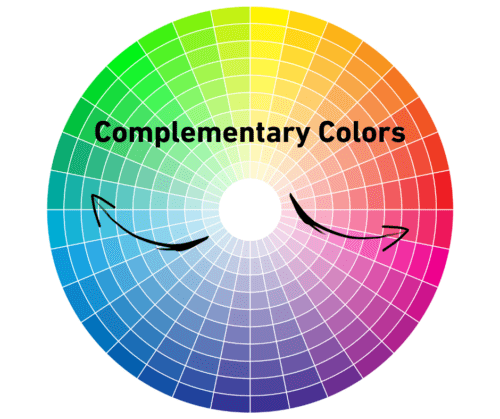
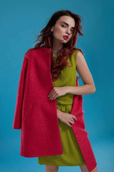
Complementary colors are those that are opposite each other on the clothing color wheel. These colors create a high-contrast look that is both striking and visually appealing. For example, red and green, blue and orange, or purple and yellow are complementary color pairs.
Analogous Colors
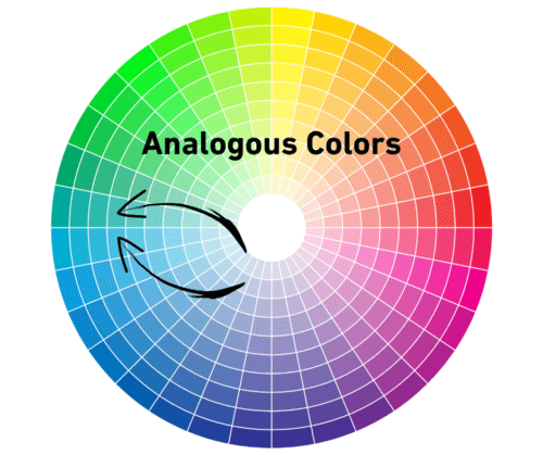
Analogous colors are those that are adjacent to each other on the color wheel. These colors create a harmonious and cohesive look, as they share similar undertones. For instance, blue, green, and teal are examples of analogous colors.
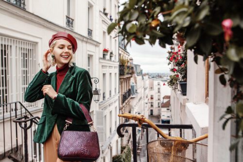
Monochromatic Colors
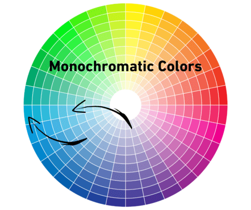
Monochromatic color schemes involve using different shades, tints, or tones of a single color. This creates a streamlined and sophisticated look, as the outfit appears to be in perfect harmony. For example, a monochromatic look might include a light blue shirt, a medium blue skirt, and dark blue accessories.
How to Use the Three Main Color Schemes in Fashion
Now that you understand the basics of the three main color schemes, let's discuss how to incorporate them into your wardrobe.
Keep in mind that not all colors within a scheme need to be of equal intensity. You can play with different shades, tints, and tones to create more depth and variety in your outfit. Additionally, consider the role of neutrals (such as black, white, and gray) in your ensemble. Neutrals can help balance out bold colors and create a more cohesive look.
Complementary Colors
When styling complementary colors, it's crucial to strike a balance between the two contrasting hues. One way to achieve this is by using one color as the dominant shade and the other as an accent. For example, you could wear a green dress with red accessories or an orange top with blue pants.
Analogous Colors
Analogous color outfits are relatively easy to create, as the colors naturally work well together. To create a cohesive look, choose one primary color and use the other colors as accents. For example, you could wear a yellow top with teal pants and a neutral purse.
Monochromatic Colors
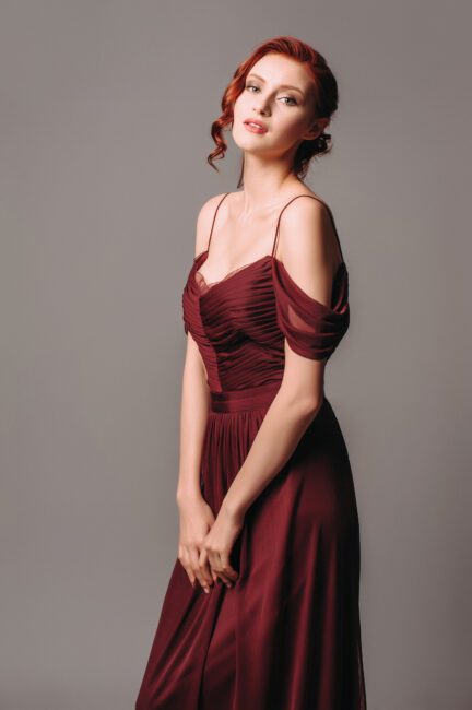
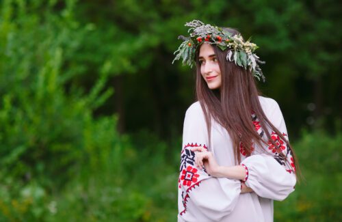
When creating a monochromatic look, it's essential to add visual interest by incorporating different textures and patterns. For example, you could wear a light blue silk blouse, a medium blue tweed skirt, and dark blue suede pumps. Or like in the example above, the dress itself has enough texture, which combined with the interesting neckline makes for an elegant look.
What Colors Are Associated with Which Emotions?
Colors can evoke various emotions and feelings, and understanding these associations can help you make more intentional choices in your wardrobe. Here are some common color-emotion associations:
Red: Passion, excitement, and energy
Orange: Creativity, enthusiasm, and warmth
Yellow: Happiness, optimism, and joy
Green: Growth, balance, and harmony
Blue: Trust, stability, and calm
Purple: Luxury, mystery, and spirituality
Black: Power, sophistication, and elegance
White: Purity, simplicity, and cleanliness
Brown: Stability, comfort, and warmth
Gray: Neutrality, balance, and sophistication
Do note that while the colors and their associated emotions can and do change over time and across cultures.
How Do Colors Change Your Figure?
Colors can also impact how your figure is perceived, making you appear taller, shorter, slimmer, or curvier. Dark colors, such as black, navy, and charcoal, can create a slimming effect by visually receding and minimizing the appearance of certain areas. Light colors, on the other hand, can make areas appear larger or more prominent. For example, wearing a light-colored top with dark-colored pants can draw attention to the upper body while creating a slimming effect on the lower body.
Color blocking and strategic placement of colors can also create illusions that alter the appearance of your figure. Vertical lines and color blocks can elongate your silhouette, making you appear taller and slimmer. Horizontal lines and blocks can make you appear wider or curvier. Choosing the right colors and patterns for your body shape can enhance your natural features and make you feel more confident in your clothing choices. For example, if you have a pear-shaped body, you can wear a darker color on the bottom and a lighter color on top to create a more proportionate appearance.
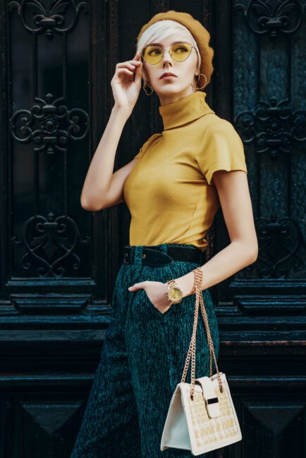
Color and Fabric Prints in Fashion
When incorporating color into your wardrobe, don't forget about the impact of fabric prints. Patterns can add visual interest and variety to your outfits, but it's essential to consider how they interact with your chosen color scheme. If you're choosing a bold print, balance it with solid colors to avoid creating an overwhelming look. For example, if you're wearing a brightly patterned skirt, pair it with a solid-colored top in a complementary or analogous color.
Consider the size of the print in relation to your body and the other elements of your outfit. Large prints can make a statement, but they may also overpower your frame or clash with other patterns. On the other hand, small prints can be more subtle and versatile. Choose prints that incorporate colors from your chosen color scheme. This will help to create a cohesive and harmonious look.
Tips on Choosing the Right Colors for Everyday and Professional Life
Selecting the right colors for your everyday and professional wardrobe can help you look polished, confident, and stylish. Here are some tips for choosing the best colors for your daily life:
Know Your Undertone
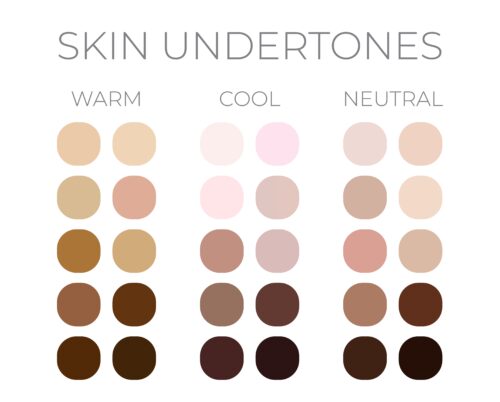
Determine whether your skin has a warm, cool, or neutral undertone, and choose colors that complement it. Warm undertones look best in warm colors, such as reds, oranges, and yellows, while cool undertones are flattered by cool colors like blues, greens, and purples.
Coordinating your undertone with your outfits, hair, makeup, and accessories is definitely worth a dedicated article in the future.
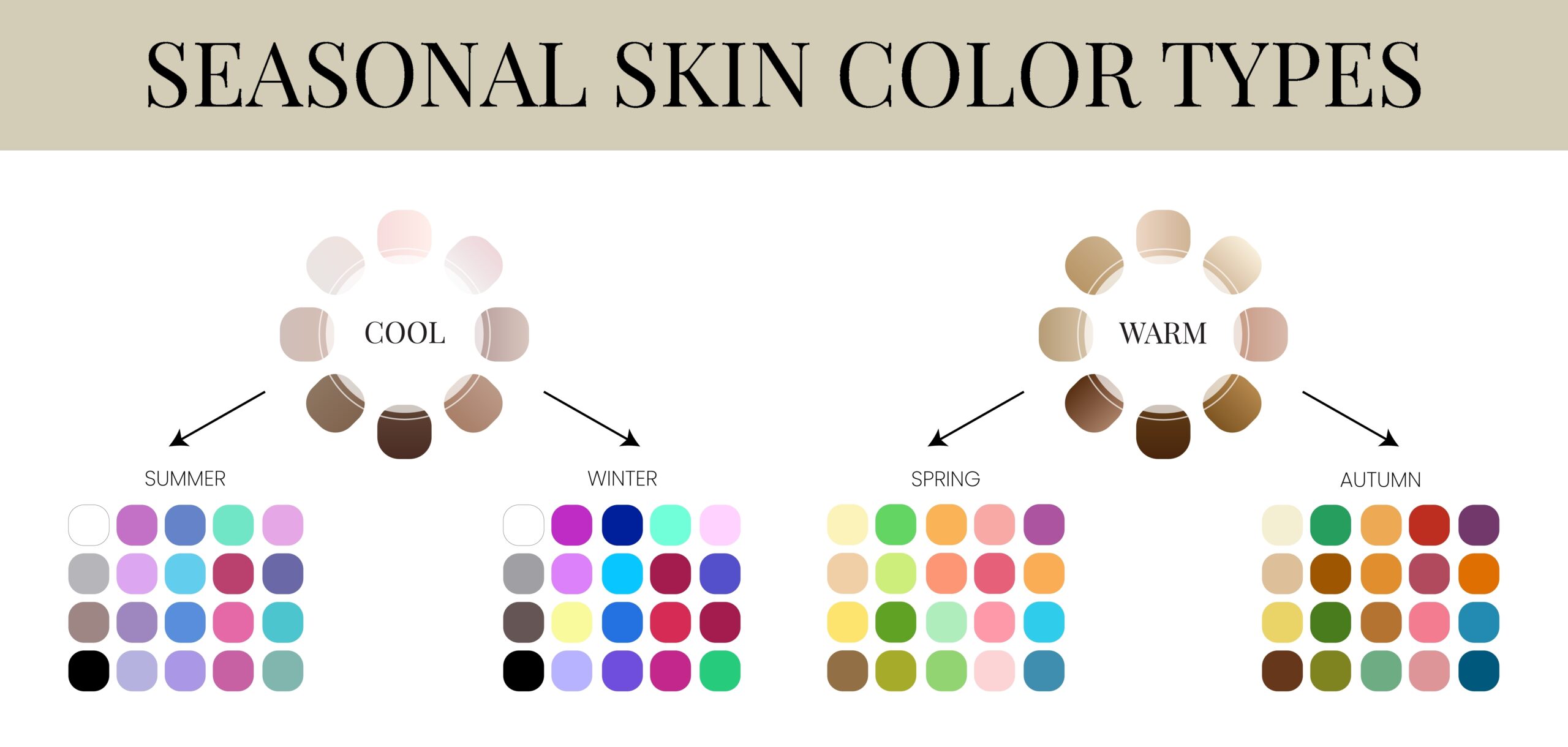
I don't really know if I fully agree with this seasonal color type graphic above, but I think it is a good reference to use for now. Expect some more research in an upcoming article.
Consider Your Environment
Think about the setting and the message you want to convey. In a professional environment, opt for colors that convey trust, stability, and authority, such as navy, gray, and black. In casual settings, feel free to experiment with bolder colors and prints.
Test Different Colors
Don't be afraid to try new colors and see how they look on you. You might be surprised at which hues make you feel and look your best. In general you will learn the most if you only change one or two things at a time, that way you can clearly and correctly identify which changed worked the best in what situation. Making too many bold changes at once can just end up being confusing.


Colors in fashion are indicators of change in times and reflect emotions of people in changing of time. Being 70 years old I have seen colors become less restrictive and more of a personal choice and freedom. Also colors have become more reflective of a general mood of the general population. Although we all are still held captive by designers of clothing and fabrics by what’s available to the public to consume. One of the emotions represented by colors can be controlling and gladly in my many years have seen this become less restrictive and welcome the change.
I am a costumer and this is an incredible resource!! Now I have something to hand students for them to reference when choosing colors for designs! Love this
Thank you for your appreciation and for sharing the knowledge!
Oh goodness, the memories! I did “Color Me Beautiful” in the 80’s. I agree that the colors did work if increase in compliments was a gauge. Thanks for reminding me.
My pleasure!
Once again, I get a lesson in fashion, design and sewing for me. Thanks. I did do color consulting for a great many years and found personal preference in choosing was mostly spot on- with guidance to shades, the models were given a wider range of colors to enhance themselves. It was so much fun to watch personalities change when color were enhancing rather that detracting.
Thanks for bringing this into play.
My pleasure, it is true the personalities do change!